 What can racial dot maps tell us about the need for prison reform?
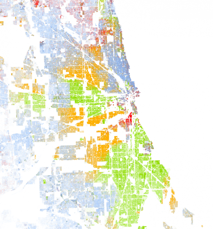
Racial dot maps created by the University of Virginia using 2010 census data show the U.S. overlaid with different colored dots—one dot for each person. The city maps help visualize segregation in familiar locals (right), but digging deeper, one blogger found odd shaped concentrations of green dots (black people, below).
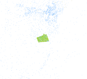
Any guesses on what those concentrations were? If you guessed correctional facilities, you’d be right. Check out more maps below at the link. These maps are an excellent, and yes, sobering visualization of the need for prison reform.
Read the original article from December 15, 2018 by LIBBY ANNE titled, The Most Sobering Thing about the Racial Dot Map here